css实现文字渐变
| 阿里云国内75折 回扣 微信号:monov8 |
| 阿里云国际,腾讯云国际,低至75折。AWS 93折 免费开户实名账号 代冲值 优惠多多 微信号:monov8 飞机:@monov6 |
css文件渐变虽然兼容性比较差,但是用在移动端和chrome中还是没有问题的。
实现文件渐变的方法有两种
1. 使用 background 的属性
2. 使用 mask 属性
方式一、
<!DOCTYPE html>
<html> <head>
<meta charset="utf-8">
<style>
span {
font-size: 30px;
background: linear-gradient(to right, red, blue);
-webkit-background-clip: text;
color: transparent;
}
</style>
</head> <body>
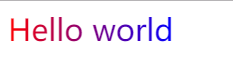
<span>Hello world</span>
</body>
</html>
效果如下
代码也是非常简单:
background: liner-gradient(to right, red, blue); 这个就是设置背景色,这是是background-image的简写,不是backround-color
-webkit-background-clip: text; 这个属性在 W3School 上有明确解释
但是并没有text 属性,所以这个只能在chrome上看到效果,在其他浏览器没有实现,它的兼容性就有很大的问题了
方式二、
<!doctype html>

<html lang="en">

<head>

<meta charset="UTF-8" />

<style type="text/css">

    h1{

        position: relative;

        color: yellow;

    }

    h1:before{

        content: attr(data-text);

        position: absolute;

        z-index: 10;

        color:pink;

        -webkit-mask:linear-gradient(to left, red, transparent );

    }

</style>

</style>

</head>

<body>

    <h1 data-text="hello world">hello world</h1>

</body>
效果如下

参考 简单说 CSS中的mask—好好利用mask-image
张鑫旭: 小tip:CSS3下的渐变文字效果实现
| 阿里云国内75折 回扣 微信号:monov8 |
| 阿里云国际,腾讯云国际,低至75折。AWS 93折 免费开户实名账号 代冲值 优惠多多 微信号:monov8 飞机:@monov6 |